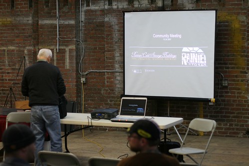
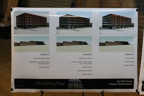
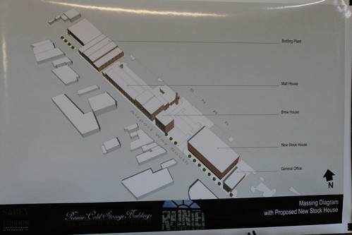
I guess the reason I'm disappointed is because I was hoping for something visionary. I'm sure that thoughtfully chosen materials could elevate this project, but I still can't help but feel that these initial designs are pretty pedestrian.
Anyway, here are the there photos. (They're not really considering Scheme F.)


I think everyone was stunned to finally be staring at the prospect of an office building across from Jules Maes. No one's ready for it. The comments were mostly negative, though also mostly resigned:
"It looks like the Best Buy in Northgate."
"It's an insult to the neighborhood."
"This is the start of the end."
Many of the ideas I wrote up for the building back in September were acknowledged in some way. For instance, the architect riffed on my Corten steel idea, though he said they couldn't use that actual material as siding because it would rust away. Instead, he offered up the idea of using Corten-style bronze ceramic siding from the Spanish tile manufacturer Tau Ceramica. (How did I know it was from Tau Ceramica? Because I happened to tile my bathroom with that exact same material, which I'm absolutely crazy about in indoor applications.)

And they mentioned my green roof idea after someone else in the audience brought up the idea. A green roof, with public access to those amazing views -- yeah, that would be great. I think the community would need to push for it, though, because I bet the set-up costs, logistical challenges, etc., would be a pain in the ass.
Several people said they'd like the new building to be brick, or partially brick, and that everyone else had been saying that they'd like the building to be brick as well. Jim Harmon from Sabey explained that the feedback they'd received thus far suggested the opposite -- that people did NOT want the building to be brick. Someone in the audience said something to the effect of "WHO said they didn't want the building to be brick?" Though I was a little scared someone in the audience might hit me in the head with a brick, I admitted that I thought that putting up new brick right next to all that gorgeous old brick wouldn't look very good. My intuition says that the contrast should be greater. But then again, what the hell do I know?
Beside, this isn't really my cause. I'm not a resident or employee or employer in Georgetown -- I'm just a fan. The opinions of those who spend their days and nights there are worth more than mine. They've already thought about it more than I have, and they're the ones who are going to be looking at the new building all the time.
Can someone with good design sense and love and respect for the area please enter the general discussion? The time is now. Send your comments to Sabey, post them here, come to the meetings, whatever. They may not act on all these ideas in the end, but I do believe that Sabey is at least listening.

I agree on new brick/old brick clashing. For one, the grout lines on new brick are too perfect in comparison to older installations, not to mention modern brick being much more precisely square. All in all it would look too clean, and jarring against a more relaxed, older brick.
ReplyDeleteThere is nothing worse than faux old next to genuine old.
I like your idea of an industrial material, similiar in color to brick or complementary, as a foil to the orignal brick. It would act like 'garnish' to the 'entree'. IMHO.
Thanks for covering the Sabey development. I learned about the meeting on your blog and attended. It was interesting to hear. Can't say I loved any of the designs shown, but everyone there seemed to express the hope that whatever gets built respects the old buildings as the focal point in that area. Hard to know how best to do that, but one can hope there's a way.
ReplyDeleteNone of those designsreally respond to the interests of the community, although they may be a departure from what Sabey would typically develop. I think when people say they want brick, what they are really saying is they want something that references the historical significance of the building building being replaced. Adaptive reuse of some of the materials from the existing building might be a way to do that.
ReplyDeleteAlso, I think it's clear that Sabey doesn't understand sustainable design at all, and if they don't figure that out, they are wasting an opportunity to define a standard for development in Georgtown which marries the need for modern building technologies with a sense of history and place combined in building design. I don't get the impression they are trememdously sophisticated in that regard, at least based on the designs.
My question is why are they tearing down the bit of street wall that is already just a facade? It has held up for twenty years without damage - including though the Nisqually quake - so clearly it would be structurally secure if given a proper bracing system on the back side. Since Sabey "has" to rip out the Stock House and isn't planning on keeping the west wall, they could at least leave that remnant as a reminder of what used to be there. Its a beautiful wall, front and back, and the drawings don't indicate that it would interfere with their proposed scheme.
ReplyDeleteI missed the design meeting, so perhaps they addressed this issue then....?